April 29, 2017
May1Reboot
 Did you see that you could save your creation?
Finally, I’m proud to release my website.
Finally, because I love the minimalist design but, at the same time, JavaScript stares at me. 👀
I think I have succeeded in achieving my goal: find a nice balance between design, user experience and technique.
The site allowed me to experience many things, with JavaScript, with design and also practice my English.
Technique
I used the WordPress REST API on the content pages.
To display the query’s response, I used a template system.
– At first, I thought that building the site entirely with Vue.js would have been really cool.
But I quickly realised that I would lack some skills to be able to build a robust solution with Vue.js and the REST API.
– The second solution would have been to use Twig.js.
The site is built with Twig, it would have been logical to use Twig with JavaScript as well. Unfortunately, I didn’t manage to run Twig.js.
– So I used the simplest solution: mustache.js. A solution that I’m only partly satisfied with.
Indeed, script tags are found in the middle of the template. Separation of concerns, always.
Fun fact, mustache.js and Twig share the same syntax to render templates: double braces.
So we have a conflict.
The trick is to use verbatim tag which tells Twig not to render the encapsulated code around verbatim.
I love WordPress, like really. With Timber, ACF and hooks, it becomes a powerful CMS, no matter what people say.
Design
In terms of design, I am very influenced by all the web designs revolving around the typography, the grid, the layout.
This kind of design is very rigorous, with strict rules, but brings a sense of appeasement.
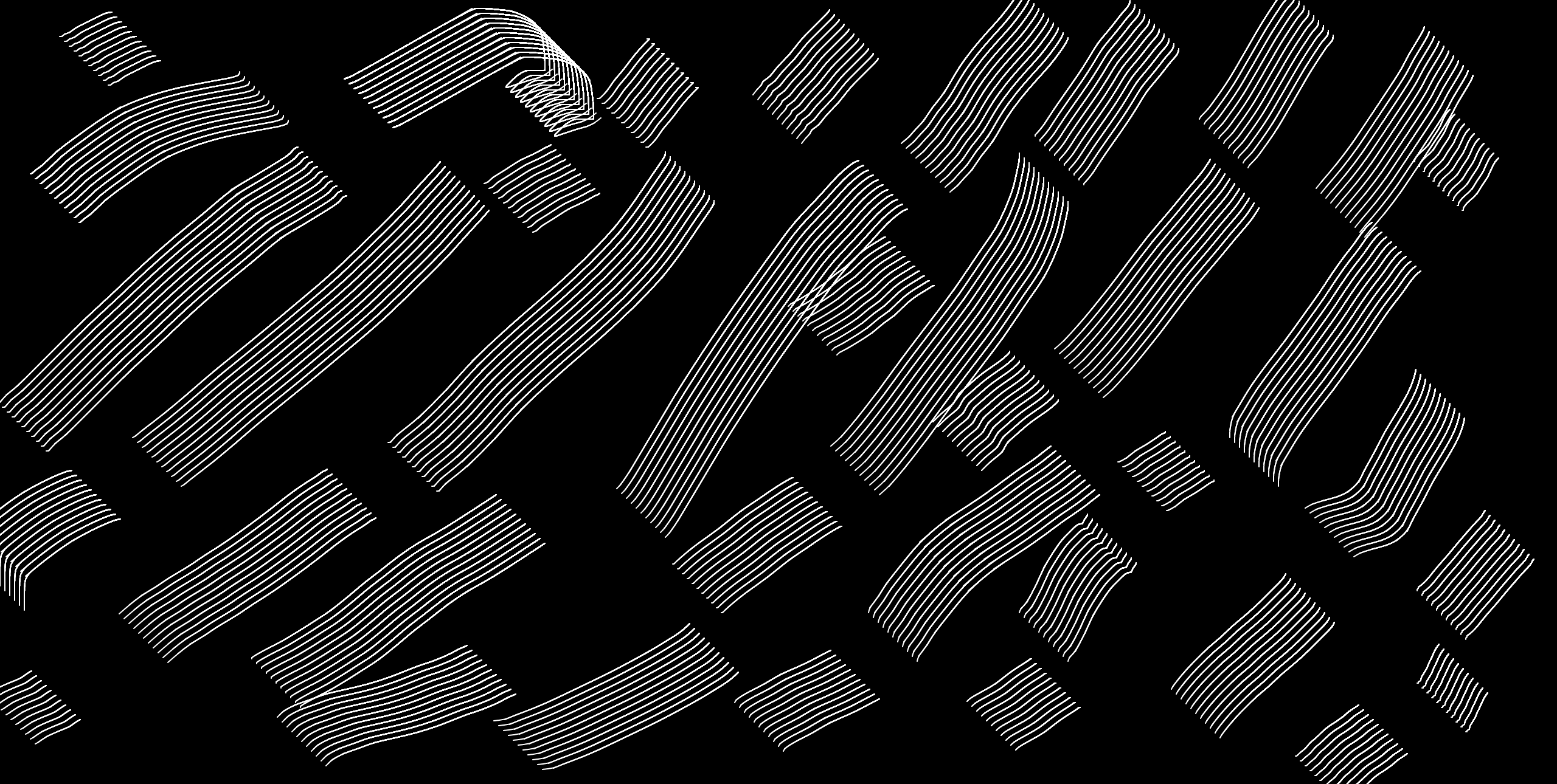
For a long time, I wanted to make a white on black website, this way its impact is stronger. Coupled with a minimalist composition, a focus on typography, the effect is immediate.
One of the first things I’ve searched when I was making my prototype is the ratio I would use.
This is a rule I impose on myself. I hope I managed to respect it. Indeed, once you choose the ratio, you can find it everywhere, font size, line height, grid, gutter…
The rule becomes exciting because you have to deal with it.
This balance is found unconsciously in the eye of the user. Like something you can’t name, but it’s there.
A feeling emerges from the rigour.
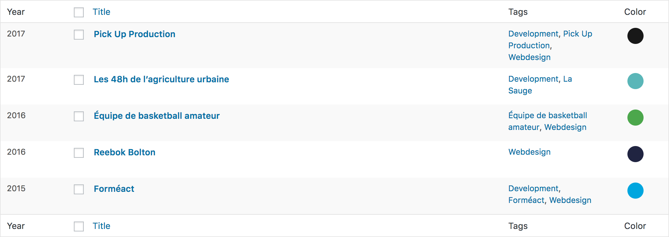
You can retrieve the source code of the site on my Github.